Dashboard Design Tool
In This Topic...
The Dashboard design tool is used to assign dataviews to the current layout and apply default configuration settings.
This is the default tool that opens when entering design mode, and the current dashboard will be displayed by default.
The Editing group contains the following standard options.

|
Open | Opens the Dashboards panel to load a different dashboard. |

|
Save | Saves the current dashboard. |

|
New | Opens the New Dashboard panel to create a new dashboard. |

|
Options | Opens the Configuration panel to change the settings for the current dashboard. |

|
Export | Opens a standard Save window to export the current dashboard to an XML file. Select a location, enter a file name, and click Save. |

|
Import | Opens the Import Dashboard panel to import a dashboard file created with the Export option. |
The Configuration group contains the following options.

|
Layout | Opens the Select Layout panel to choose a different layout configuration for the dashboard. |

|
Insert | Opens the Select Content panel to add a dataview configuration to the dashboard. |
When the Dashboard design window opens, the currently selected dashboard will open by default. Use the options in the Edit group to Open or Import an existing dashboard, or use New to create a new dashboard.
Proceed to the Dashboard Editing Screen section when the proper dashboard is displayed.
Dashboards Panel
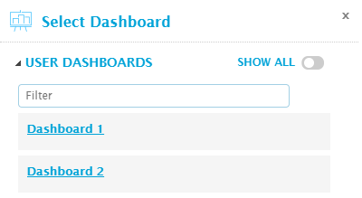
The Select Dashboard panel opens to the right of the screen when selecting Open from the Edit group. Click X to close the panel again.
The dashboards are displayed by category. Each category can be expanded or collapsed using the  and
and  icons.
The User Dashboards category includes all dashboards that you have marked for Quick Access, currently or in the past.
Click Show All to display all available dashboards. This includes dashboards that you have created, dashboards that have been marked as available to everyone, and dashboards that you can access due to a security role.
Click the name of a dashboard to open it. Proceed to the Dashboard Editing Screen section.
New Dashboard Panel
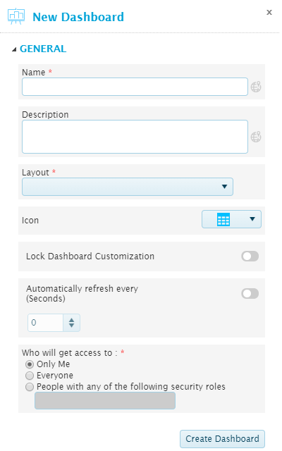
The New Dashboard panel opens to the right of the screen when selecting New from the Edit group. Click X to close the panel again.
| Name | Enter the name of the dashboard. |
| The text in this field can be translated |
|
| Description | Enter a description of the dashboard. |
| The text in this field can be translated |
|
| Layout | Select a layout configuration. Layouts can be created and customized in the Layout Design Tool section. |
| Icon | Select an icon to be displayed in the Quick Access group in analysis mode. |
| Lock dashboard customization | If the dashboard is unlocked, users will be able to customize many settings for the dashboard and dataviews, such as filtering and sorting. These custom settings only apply to their own view, and will not affect other users. |
| If the dashboard is locked, users can still select from the available display modes, but cannot modify or save custom settings. | |
| Automatically refresh every | When activated, the dashboard will refresh all data at intervals entered in the Seconds field. |
| Who will get access to | Select if the dashboard is private or shared. This affects the ability to see and edit the dashboard in the Dashboard Design Tool, and the ability to see the dashboard in Analysis mode. |
| Only you will be able to see this dashboard. | |
| The dashboard will be visible to all users. | |
| Only accessible to users with a specific security role assigned to their user account. Select this option and enter the Code of the required security role. | |
| Multiple roles can be provided, formatted as comma-separated and without spaces. If a user has at least one of these roles, they will be able to see the dashboard. |
Click Create Dashboard to display the dashboard in the Dashboard Editing Screen. Note that the dashboard is not yet saved at this point.
Dashboard Configuration Panel
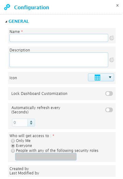
The Configuration panel opens to the right of the screen when selecting Options from the Edit group. Click X to close the panel again.
This panel is used to edit the configuration options for the current dashboard.
The General category provides access to the general settings for the dashboard.
| Name | Enter the name of the dashboard. |
| The text in this field can be translated |
|
| Description | Enter a description of the dashboard. |
| The text in this field can be translated |
|
| Icon | Select an icon to be displayed in the Quick Access group in analysis mode. |
| Lock dashboard customization | If the dashboard is unlocked, users in analysis mode will be able to customize many settings for the dashboard and dataviews, such as filtering and sorting. These custom settings only apply to their own view, and will not affect other users. |
| If the dashboard is locked, users can still select from the available display modes, but cannot modify or save custom settings. | |
| Automatically refresh every | When activated, the dashboard will refresh all data at intervals entered in the Seconds field. |
| Who will get access to | Select if the dashboard is private or shared. This affects the ability to see and edit the dashboard in the Dashboard Design Tool, and the ability to see the dashboard in Analysis mode. |
| Only you will be able to see this dashboard. | |
| The dashboard will be visible to all users. | |
| Only accessible to users with a specific security role assigned to their user account. Select this option and enter the Code of the required security role. | |
| Multiple roles can be provided, formatted as comma-separated and without spaces. If a user has at least one of these roles, they will be able to see the dashboard. | |
| Created by | Identifies the date and time the dashboard was created, and the user who created it. |
| Last Modified by | Identifies the last date and time the dashboard was changed, and the user who made the changes. |
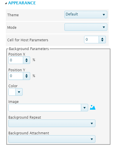
The Appearance category contains settings for the general appearance of the dashboard. Note that changes will not be visible in dashboard designer mode.
This feature is not in use.
Import Dashboard Panel
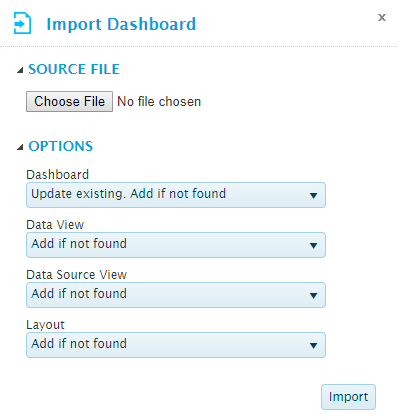
The Import Dashboard panel opens to the right of the screen when selecting Import from the Edit group. Click X to close the panel again.
This panel is used to import a dashboard that has been exported to a file.
The Source File category is used to select the import file. Click the button to open a standard file browser window. Locate and select the appropriate export file. The file name appears next to the button.
The Options category controls how components will be imported. The following options are available for each component.
| This component will not be imported. | |
| The import will be added as a new component, even if a component already exists with the same name. | |
| If a component exists with the same name, the import will not be performed. Otherwise, the import will be added as a new component. | |
| If a component exists with the same name, it will be updated. Otherwise, the import will be added as a new component. | |
| If a component exists with the same name, it will be updated. Otherwise, the import will not be performed. |
The following components can be set for import.
Click Import to import the file.
Note: If one of the Update Existing options are selected and more than one matching component is found, the first matching component will be updated.
If one of the Update Existing options are selected, the saved component is updated. If the dashboard currently open in the Dashboard Editing Screen is replaced by an imported dashboard, it will not show any changes immediately. Re-open the saved dashboard to see the imported changes. If the dashboard is saved before the imported changes are re-loaded, it will overwrite the imported changes.
Select Layout Panel
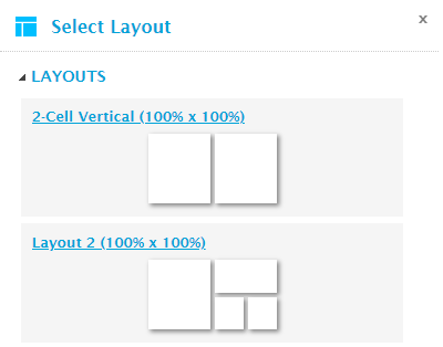
The Select Layout panel opens to the right of the screen when selecting Layout from the Dashboard group. Click X to close the panel again.
This panel is used to apply a different saved layout to the current dashboard.
Each layout name is followed by the percentage size of the dashboard, as configured in the layout design. A preview of the cell division is displayed below the name.
Click a name to select and apply the new layout. Any dataviews already assigned to the dashboard will be re-assigned to the cells with the same cell number as in the previous layout. If no matching cell exists in the new layout, the dataview will be placed in the tray section at the bottom of the dashboard.
Note that the changes are not saved until the dashboard is saved.
Select Content Panel
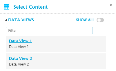
The Select Content panel opens to the right of the screen when selecting Insert from the Dashboard group or clicking the add icon  in a cell or the tray section. Click X to close the panel again.
The Data Views category lists available dataview configurations.
Click Show All to display all available dataviews. This includes dataviews that you have created, dataviews that have been marked as available to everyone, and dataviews that you can access due to a security role.
To locate a specific dataview, enter text in the Filter field. The listed dataviews are filtered as you type.
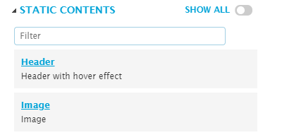
Static content views are generally used to build structure and controls into a dashboard. The Static Contents group lists the available built-in options, as well as any available Templates that have been defined as Standalone Static Content.
Click Show All to display all available options. This includes templates that you have created, templates that have been marked as available to everyone, and templates that you can access due to a security role.
To locate a specific option, enter text in the Filter field. The listed options are filtered as you type.
The following system options are available.
The Miscellaneous category lists other content types that can be added to a cell.
Click Show All to display all available content types in this category.
To locate a specific content type, enter text in the Filter field. The listed content types are filtered as you type.
The following content types are available.
| Web Page | The cell can display an external web page. The URL can contain embedded query strings to receive variables, allowing selections in the dashboard to control the content. |
Click a name to add the dataview or static content. If adding from a cell, the selection is added to that cell. If adding from the tray section or the Insert option, the selection is added to the tray section, but can then be moved to a cell.
The addition of the selected component is automatically saved, although no other changes to the dashboard are saved.

